EV Dashboard Overview | Reports
The Nayax EV Dashboard manages your charging network with Live Status for real-time activity, Analytics for insights, and Live Sessions for detailed records.
Video Guide
00:00: The Nayax EV Dashboard manages your charging network with Live Status for real-time activity, Analytics for insights, and Live Sessions for detailed records.
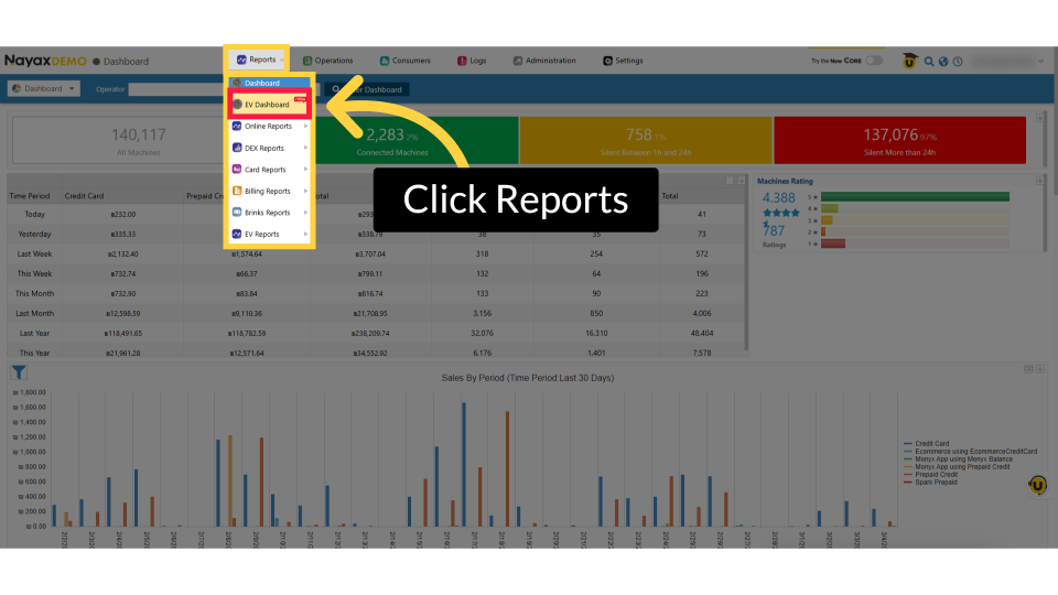
00:09: From the dashboard of your Nayax Core platform click the Reports tab then click on EV Dashboard in the drop-down menu.
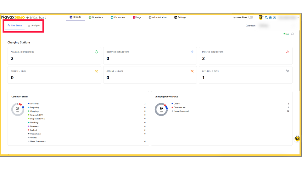
00:16: This is your real‑time hub for all EV charging activity, featuring two main tabs: Live Status and Analytics.
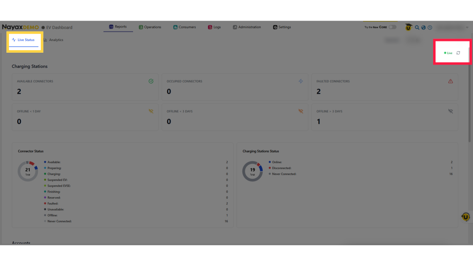
00:24: In Live Status - The dashboard updates instantly, and the green Live badge confirms real‑time info.
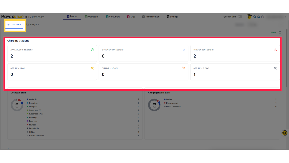
00:30: Charging Stations displays six tiles: available, occupied, faulted connectors, and offline stations, providing a quick snapshot of status.
00:38: The Occupied Connectors, when hovered over, show the charging status, suspended EV and EVSE sessions, and sessions about to end.
00:47: The Connector Status chart shows each connector’s state: Preparing, Charging, Suspended, Finishing, Faulted, Unavailable, Offline, or Never Connected, with the total number in the center.
00:58: The Charging Stations Status chart shows stations Online, Disconnected, or Never Connected, giving you a quick view of network coverage and connectivity issues.
01:08: The Accounts status shows your total EV driver base, including active, blocked, and pending users, cards expiring soon, and private‑station users.
01:17: Payments Today shows your revenue at a glance, successful payments with totals and counts, plus failed transactions by ID to help spot issues.
01:25: The Live Sessions table displays all active charging session data, including Session ID, station, location, duration, energy, etc.
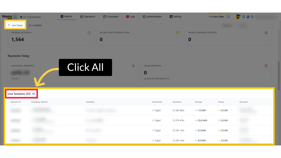
01:34: Click 'All' next to the Live Sessions heading to view the full list of all charging sessions.
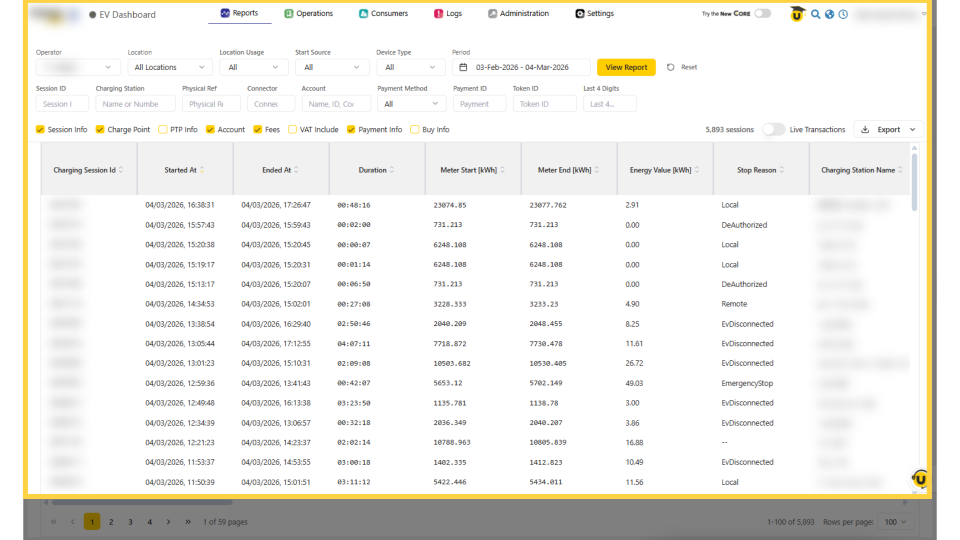
01:39: The Sessions shows all charging session records. Use filters like location, source, device type, and date to narrow results, then click View Report to see the filtered list.
01:49: From the EV Dashboard, click Analytics next to live Status to view historical performance data for trends, revenue, and charging network usage.
01:58: In the top‑right, choose your date range from Today, 7 Days, 30 Days, or Custom. The timestamp shows when the data was last updated.
02:06: In Analytics, you’ll see four key metrics: Total Revenue, Total Energy, Total Sessions, and Average Session Duration, giving a quick snapshot of your network’s performance.
02:17: The Revenue chart displays daily revenue as a bar chart, highlighting busy periods and trends. Hover over a bar for exact daily revenue.
02:26: The Energy chart shows daily kWh. Hover over any bar to see Energy delivered, Peak Power, and Sessions, helping you spot peak usage and overall demand.
02:36: Rank sites by Revenue, Energy, or Sessions. The table shows rank, name, revenue, energy, and session count. Adjust rows per page to spot top performers quickly.
Click Reports
Image AttachedFrom the dashboard of your Nayax Core platform click the Reports tab then click on EV Dashboard in the drop-down menu.
EV Dashboard
Image AttachedThis is your real‑time hub for all EV charging activity, featuring two main tabs: Live Status and Analytics.
Live Status View
Image AttachedIn Live Status - The dashboard updates instantly, and the green Live badge confirms real‑time info.
Charging Stations: Connector Summary Cards
Image AttachedCharging Stations displays six tiles: available, occupied, faulted connectors, and offline stations, providing a quick snapshot of status.
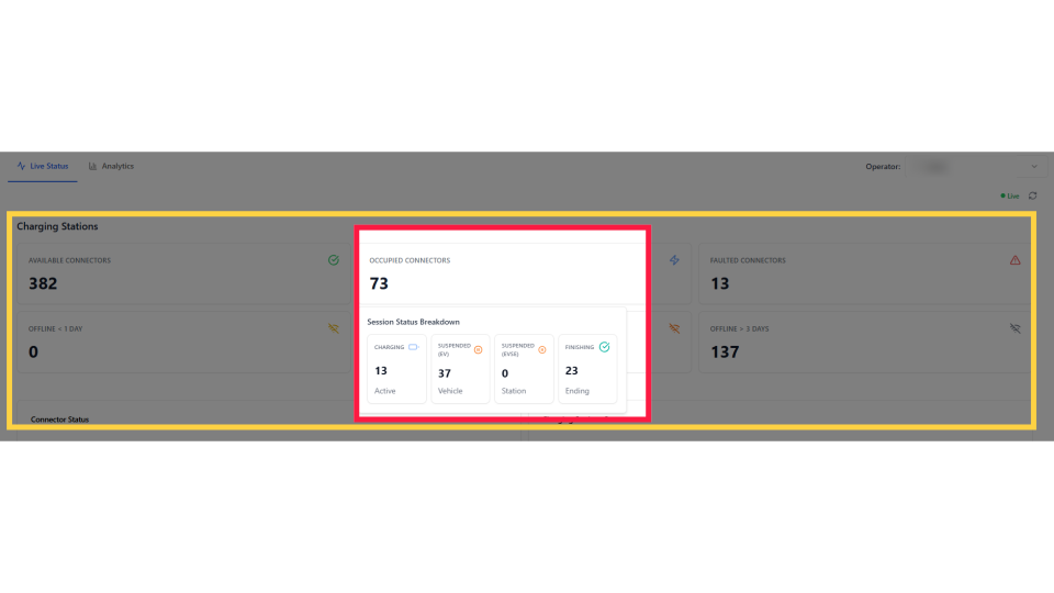
Occupied Connector Breakdown
Image AttachedThe Occupied Connectors, when hovered over, show the charging status, suspended EV and EVSE sessions, and sessions about to end.
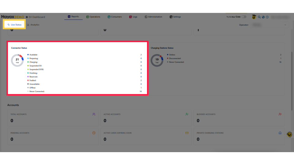
Connector Status Chart
Image AttachedThe Connector Status chart shows each connector’s state: Preparing, Charging, Suspended, Unavailable, Offline, etc, with the total number in the center.
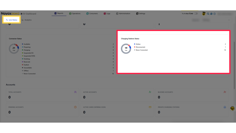
Charging Station Status Chart
Image AttachedThe Charging Stations Status chart shows stations Online, Disconnected, or Never Connected, giving you a quick view of network coverage and connectivity issues.
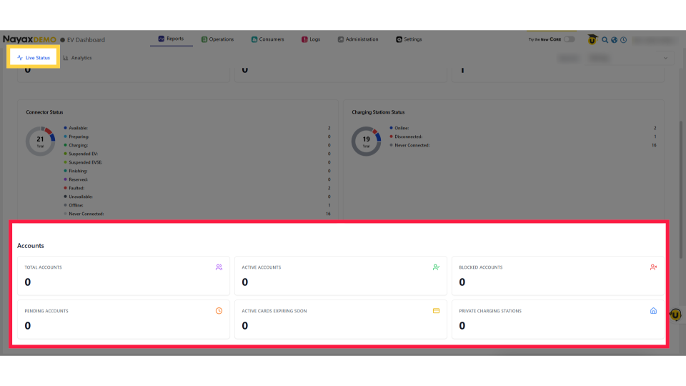
Accounts Section
Image AttachedThe Accounts status shows your total EV driver base, including active, blocked, and pending users, cards expiring soon, and private‑station users.
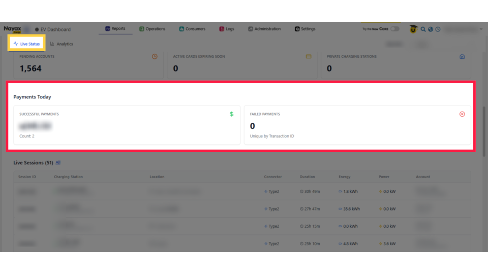
Payments Today
Image AttachedPayments Today shows your revenue at a glance, successful payments with totals and counts, plus failed transactions by ID to help spot issues.
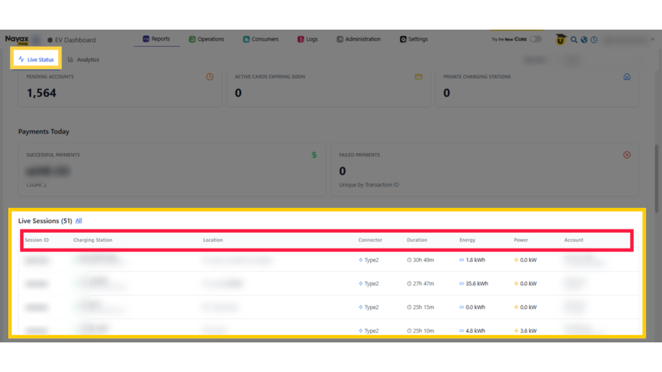
Live Sessions Table
Image AttachedThe Live Sessions table displays all active charging session data, including Session ID, station, location, duration, energy, etc.
Click All
Image AttachedClick 'All' next to the Live Sessions heading to view the full list of all charging sessions.
All Sessions Screen
Image AttachedThe Sessions shows all charging session records. Use filters like location, source, device type, and date to narrow results, then click View Report to see the filtered list.
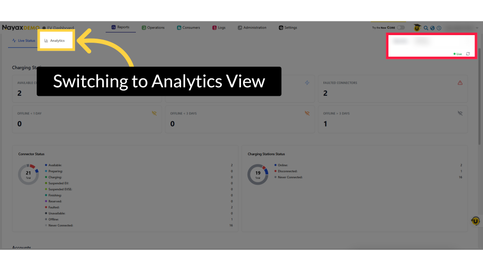
Switching to Analytics View
Image AttachedFrom the EV Dashboard, click Analytics next to live Status to view historical performance data for trends, revenue, and charging network usage.
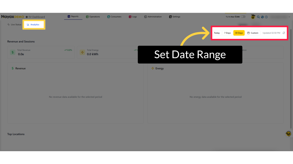
Set Date Range
Image AttachedIn the top‑right, choose your date range from Today, 30 Days, or Custom. The timestamp shows when the data was last updated.
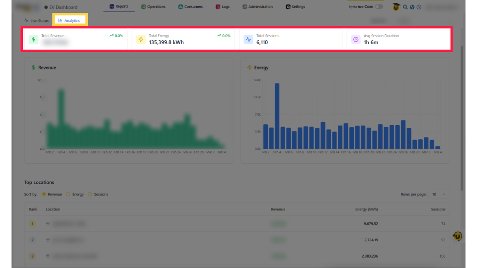
Revenue and Sessions
Image AttachedIn Analytics, you’ll see four key metrics: Total Revenue, Total Energy, Total Sessions, and Average Session Duration, giving a quick snapshot of your network’s performance.
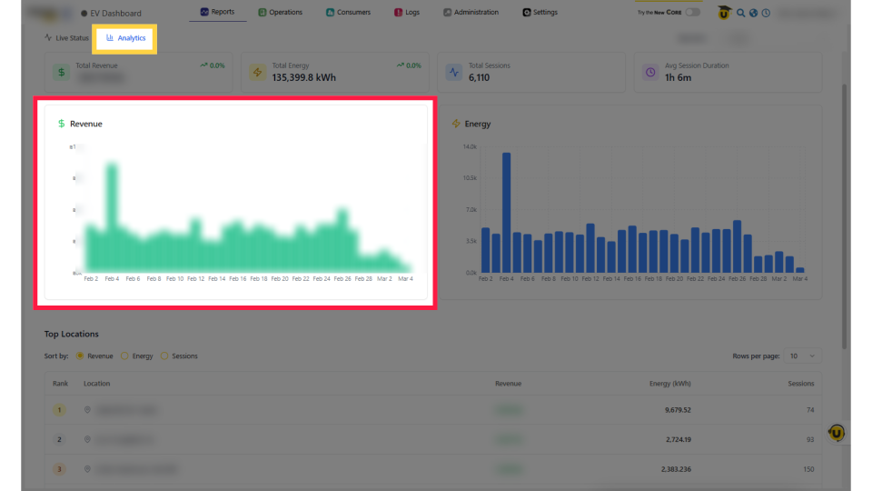
Revenue Chart
Image AttachedThe Revenue chart displays daily revenue as a bar chart, highlighting busy periods and trends. Hover over a bar for exact daily revenue.
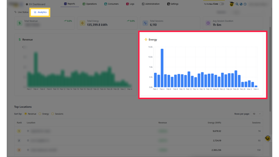
Energy Chart
Image AttachedThe Energy chart shows daily kWh. Hover over any bar to see Energy delivered, Peak Power, and Sessions, helping you spot peak usage and overall demand.
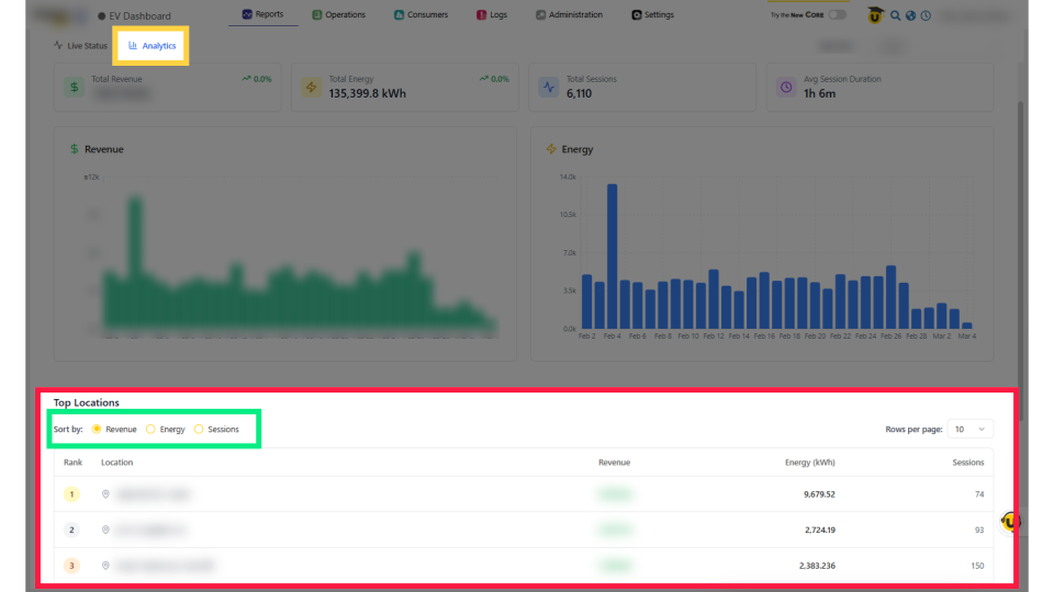
Top Locations Table
Image AttachedRank sites by Revenue, Energy, or Sessions. The table shows rank, name, revenue, energy, and session count. Adjust rows per page to spot top performers quickly.
Thank you!
Did you find this article helpful?